Patient-first health robot
Designing an intuitive interface for a medical companion built for elders
Role
Lead Product Designer
Responsabilites
User research, UX strategy, UI design, client management, developer handoff
Scope
End-to-end design (research, flows, high fidelity UI, development)
Duration
4 months
Tools
User research, interviews Figma
Results
Research, UI kit and ready-to-develop digital experience


Homedoctor is a Spain based health-tech startup founded by doctors with the goal of bringing professional medical care into the home.
Context
Their product ecosystem, the MedBot, combines a connected device capable of taking key vitals (blood pressure, oxygen saturation, ECG, temperature, auscultation, BMI) with a digital service for live doctor consultations and preventive care content.
What was at stake?
How can we design a UI for tech-averse elderly users, helping them trust a device they’ve never used, and encouraging them to replace physical doctor visits with virtual ones?
The interface needed to make complex medical tasks feel simple, safe, and human. All while working on limited hardware and supporting future multi-language expansion.
The solution
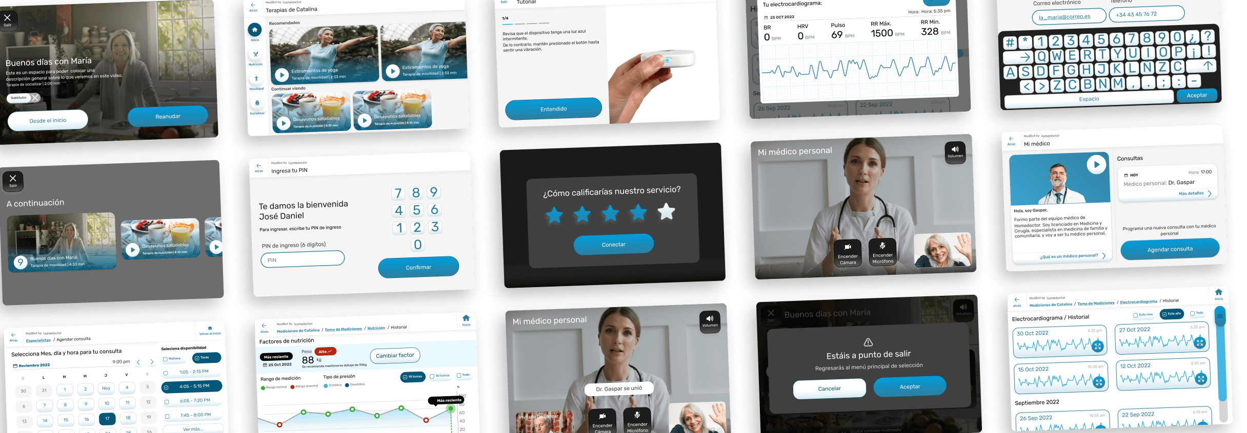
We designed a medical companion device interface that feels human, intuitive, and safe for elders with little to no tech experience.
It uses tactile depth (neumorphism), haptic feedback, and clearly labeled actions to make complex health measurements simple and trustworthy. Every flow, whether taking vitals or connecting with a doctor, was reduced to a few large, readable steps that build confidence instead of confusion.


Goals & Constrains
Main Goal
Drive adoption among elderly users who are not comfortable with technology by making interactions self-explanatory and trustworthy.
Design Constrains


Stakeholders
HomeDoctor’s founding doctors (experts in medicine but new to UX/UI) were deeply involved. Their main concern was clarity and accessibility:
“Every screen must be readable, understandable, and usable by someone who’s never touched a smartphone.”
.-Ángel Ybañez
Chief Business Office, Homedoctor
Users & Target Segments
Our primary users were elderly adults who require regular monitoring but often avoid technology. They needed clarity over aesthetics, physical reassurance over digital abstraction, and trust over novelty.
User Personas

Maria, 76
The Cautious Learner
Former teacher, lives alone, mild hypertension.
Fears breaking the device or misreading a result.
Wants reassurance through clear messages and confirmation sounds.
Don José, 81
The Practical Patient
Former taxi driver, diabetic, prefers quick, tangible feedback.
Fears breaking the device or misreading a result.
Wants reassurance through clear messages and confirmation sounds.


Elena, 68
The Family Caregiver
Cares for her husband with COPD.
Slightly more tech-savvy but confused by medical jargon.
Needs simple explanations instead of raw data.
Key Insights
Fear of error is stronger than fear of illness
users worry more about misusing technology than about missing a vital reading.
Familiarity breeds trust
elderly users relate better to tactile, physical cues (buttons, shadows, vibrations).
Literal beats abstract
icons without labels fail; every icon needs a written cue.
Too many options paralyze
keep actions under five per screen.
Feedback = confidence
lights, haptics, and confirmation sounds increase perceived accuracy and safety.
Information Architecture & Wireframing
Wireframing


Information Architecture

Interaction & Visual Design

BIG Typography
Large sans-serif, ≥ 18 pt, high contrast (≥ 4.5:1 WCAG AA).

BIG Touch targets
≥ 56 px minimum for all actionable areas.

Easy color system
Neutral light background, vivid feedback & action colors paired with icons and labels to avoid color-blind dependency.

Haptic feedback
Short vibration and light feedback after any valid/invalid action.

Accessibility settings
Optional high-contrast mode, adjustable text and button scale

Prototyping, Testing & Iteration
Tool: Figma

Participants: 6 elders (65–82 yrs) matching the personas.

Tasks Tested:
Taking blood pressure
Launching a videocall with a medic
Making an appointment with an specialist
Retrying a failed measurement
Accessing entertainment content
Using the SOS function
Most important iterations


Collaboration & Handoff
Delivered Figma files with component specs and responsive behavior.
Annotated screens for error handling, feedback states, and haptic triggers.
Maintained daily syncs to align updates after screen-resolution changes.
Developers reported first-pass implementation alignment > 90 %, reducing rework time significantly.
Outcomes & Impact
M
self-measurements completed
k
consultations per year
%
of medical cases resolved remotely
k
homes subscribed
/ 10
user satisfaction score
sec.
average emergency response time

Learnings
Lack of Design System
A design system with proper variables and scales would have saved countless hours when we needed to re-scale all existing screens
Revive neumorphism was a win
Improved usability but limited aesthetic refinement, a hybrid approach (tactile depth + modern clarity) would balance better.
Prioritization of business over UX
Business priorities (emphasis on content streaming) overruled some UX best practices -> a common, instructive tension between product and design.
